Tableau provides a good set of trend line, reference line and band options but sometimes you want to overlay curves based on a custom equation. Logistic regression curves, sine curves, quantile regression curves…. And want these overlay curves to be smooth…
This is very easy to do by taking advantage of the technique I shared when building Coxcomb charts and radial treemaps. If you know the equation (or know how to get to it) and it can be described in Tableau’s calculation language you can do so using a table calculation. But doing the fit dynamically involves R and when you’re passing the data to R you need to do some basic NULL handling. Here are two examples showing what the results might look like. You can see that despite very few points in my dataset and large gaps between them, the curves look very smooth.

The key component is the bin field created on the variable that’s on the X axis. In Tableau bins can be used to trigger densification by turning on “Show Missing Values” option on the bin. Doing so adds NULL rows into the data backing up the visualization, which you can fill with values from table calculations (including SCRIPT_ functions). In your R script, you need to remove these artificially generated NULLs, in order not to confuse the curve fitting procedure you’re applying.
I tied the bin size to a parameter so you can try different values to make the curves coarser or smoother.
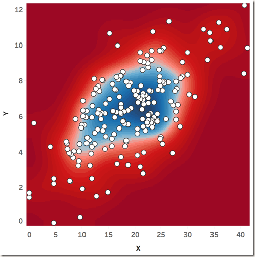
If you want to take this technique it a bit further you could use one bin for each axis which will allow you to create a grid. Then you an treat each cell like a pixel in a raster and draw shaded areas such as contours.
Below you can see two examples of this. First one estimates the bivariate kernel density of the data points in the viz on-the-fly using R on the fly and draws the contours using the secondary axes of this dual (technically quadruple) axis chart.
The second chart uses the same data to fit a one-class SVM (support vector machine) which is often used for outlier/novelty detection with a Gaussian radial basis function then draws the decision boundaries using the secondary axes (blue ellipse). Suspected outliers are shown in red while inliers are shown in white.
You can download the sample Tableau workbook from HERE.


Hi Bora, I’d love to see how you got the ellipse on your scatterplot but Tableau says the workbook you’ve linked to is not currently available on Tableau Public.
It uses R and R is currently not supported on Tableau Public. You can download it from my OneDrive using the link at the end of the post.
Hi Bora, could you please post this file again or show screenshots of what you did exactly to do this I am very curious.
Hey Bora,
I’m wondering if I could use the kernel density formula in a calculated field to generate a density plot in Tableau and, if so, how that would actually work. My data set is a few hundred y-x coordinates, and I’ve successfully plotted them in a scattered plot. I just need help generated the density plot. Thanks!
The kernel density formula I have in mind is described here: https://stat.ethz.ch/R-manual/R-devel/library/stats/html/density.html
The example workbook in the blog post generates the kernel density in Tableau using R. It passes the data points to R then gets the kernel density using square marks on a secondary axis to draw underneath the marks. So it is all done on the fly (not a background image). It sounds like this is what you’re looking for. Anything wrong with the solution provided in the workbook?
Is there any way to run calculated fields using bin fields within Tableau itself? I’m trying to publish to Tableau Online so the R or Python integration isn’t possible. I’m trying to write if, else statements to approximate a custom curve, however, it appears that this can’t be done using bin fields because. Tableau complains that bin fields cannot be compared to float (or calculated fields cannot be the type bins). Thank you.
You can use a calculated field like INDEX() or a fraction of index running along the bin field and compare that with your float or int instead of direct comparisons against bins.