In this year’s last post, I want to put a little spin on the bar charts and tree maps : )
While in a lot of cases pie charts aren’t great, they nicely convey the part-whole relationship, work reasonably well as long as the number of slices are small and used very commonly including by Tableau users. I recently came across two blog posts that took it a step further and built donut charts (1, 2) out of pie charts. Both of these posts used overlay methods to hide the center of the pie chart which makes them easy to replicate (and that is what’s great about them) however they either have misalignment issues or when you interact with the donut e.g. by clicking on it or hovering the z-order changes and your pie chart floats above the overlay so it is no longer a donut chart.
I wanted to do something that doesn’t have any of these issues and while doing that also enable stacking in various ways so it can also be used to generate radial bar charts and radial tree maps (also known as sunburst charts).
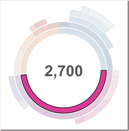
I also wanted to add some customizability such as the thickness of the bands and spacing between them. Below is resulting radial tree map. You can click HERE or on the image to play with the interactive version published on Tableau Public and download the Tableau workbook to take a closer look at how it works and apply to your own data if you like.
I created some imaginary sales data broken into categories: Furniture, Electronics and Food and then further into sub-categories e.g. Security Systems, Home Theater, Baked Goods etc. In the image above, the 3 major categories are represented by the inner-most ring. Each outer ring represents an immediate subcategory of the adjacent inner ring hence creating a hierarchical tree-view when read from the center outward.
The chart is created using the polygon mark type. Each point that make up the polygon are computed on the fly using 9 table calculations that are nested inside each other.
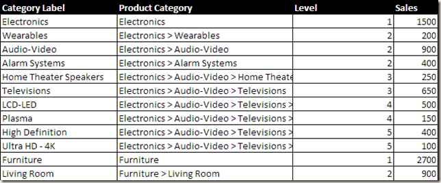
Input data looks like the following :

This table could be further simplified by counting the occurrences of > in Product Category column using a calculated field instead of having a Level field but I chose not to in case I wire this up to a live SQL query at some point and Category name contained a > that’s not properly escaped.
I used the same trick I showed in my Coxcomb chart and pictogram posts to generate extra rows that leverages custom SQL, binning and densification to hold the calculated coordinates since each arc is approximated using ~200 points to get a smooth curve while there is only 1 row in the input data for each category. Please take a look at the previous posts if you’re curious how this works. The rest it trigonometry.
If you put this inside a dashboard and add an action you can also display the sum of values for selected slices at the center of this chart. As I said, since the chart is parameterized, you can change the spacing etc. between layers which is what I did below to get a slightly different look.
I am not going to get into the details of how exactly each calculation works. Best way to recreate these charts with your data is to convert your data into the format used by the workbook (as shown in the Excel spreadsheet above) and replace the data source. This way, you won’t have to worry about calculation settings and it will just work.
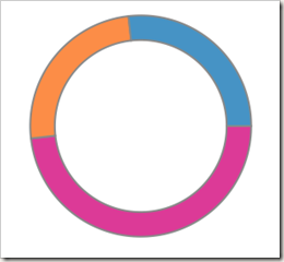
Now to get a donut chart, all you need is data that doesn’t have multiple levels and same calculations will give you this result.
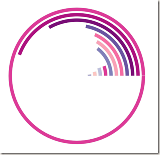
With slight modifications to 3 of the 9 calculations, it is also possible to generate radial bar charts using the same template. In the example below I also changed the sort order such that I get bars in ascending order from the center outward. The outer-most ring represents all of Furniture sales while inner rings represent sub-categories of furniture.
And there you have it. One template to build 3 common radial charts in Tableau. I hope you find this useful.
Happy new year!


This is a really cool way to represent data. Is it possible to set up either labels or annotate certain fields when criteria are met? For instance, I’d like to see labels or annotated fields when sales are less than X? Thank you so much!
Curious how you’d do the radial chart for a percentage, e.g. percentage to goal? And to limit it to a half circle?
Hi boraberan, wonderful work, thanks. can you please explain X and y calculation? Or do you have step by step explaination. I tried the chart it came out, my manager to give a presentation on it to entire team now.
You are a source of inspiration for all Tableau pros! Just one question: how would you go to combine a Sunburst chart with a Radial Bar Chart- basically aligning the outer circle with the bar bases?
Reblogged this on tableau dot live.
Pingback: Sunburst Chart Tutorial - Tableau Magic