Custom shapes are great for simplifying the association between marks and what they represent so the viewers can enjoy the visualization without having to constantly check the legend to remind themselves what they’re looking at. But you can see them being used for various purposes in the wild such as navigation/filter controls in dashboards. Custom polygons provide another great way to draw custom shapes in Tableau although they are almost exclusively used in maps by most.
In this blog post, I will be sharing some rather unusual example use cases for both of these mark types about which I got questions about from many Tableau users via the blog or in person conversations at this year’s Tableau conference.
Before we go on any further, please keep in mind that large and/or asymmetrical shapes can negatively affect the accurate readability of your visualizations since their center (which is where the value on the axis corresponds) may be difficult to pinpoint AND most of the data below (while they may look prettier this way) can be more accurately depicted with basic chart types like the good old bar chart. For most of these examples I relied on the Sample – Superstore dataset even though the titles of the visualizations may say otherwise. All of these visualizations are published on Tableau public for you to download and explore. You can also find information as comments inside the calculated fields that I created.
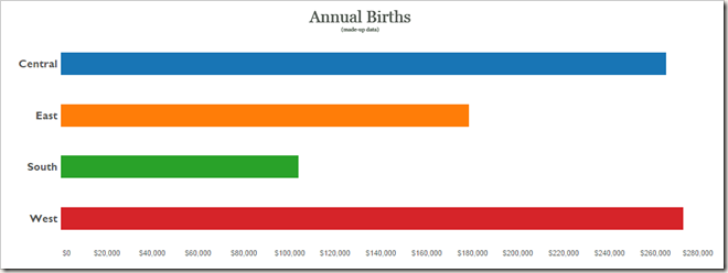
Let’s start with using marks to create the customized bar chart you see below.
In simple bar chart form this would look like the following:

Now, how do you make this imaginary Sales data look like a chart that shows # births annually? By making the bars look like little kids holding hands, of course. : )
The core piece is the calculation that generates the evenly spaced marks. In this case I divided SUM(Sales) for each region in Superstore dataset into chunks of 5000 until we span the total amount.

This gets you most of the way and you can actually stop at this point if you don’t care about any more precision than increments of 5000. But what happens if you want to be a bit more precise? By using another calculation to show different marks for fractions of 5000…

In this case, my dataset contained enough rows to accommodate all the marks I needed for my visualization. But what if it didn’t? The next example answers this question, as well as showing a different chart type.
Stacked icons are commonly used when author of the visualization isn’t too worried about exactness conveyed by the chart. For example our next pictogram shows tanks in Bacteria and Osterlich armies. I can clearly see Bacteria has the superior army. The difference is large enough that even a coarse visualization like this gets the point across. If I cared to count the tanks in the viz and looked up the population, I could have even found out that it corresponds to 0.46 tanks per capita! : )
In this case since my dataset had fewer rows than the marks shown on the viz, I had to generate rows. To achieve this I used one of the densification tricks I showed earlier in my Coxcomb chart blog post. You can see the custom SQL query below which adds a new row for each existing row with the value for Sales set to 0.

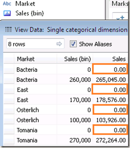
After doing this, I can right click on my Sales column and select “Create Bins”. I need to set the bin size to the quantity my each icon will represent. In the sample workbook, I created bins of 10,000 (icon says 10^6 tanks but underlying data is still aggregated Superstore). Now if I look at my data, this is what I see (0 rows are highlighted).

There are really two values in my dataset for each Market. But if I drag Sales (bin) into rows or columns shelf, now I can select “Show Missing Values” from pill context menu to tell Tableau also to show me the buckets that contain no data. Bins are normally used to generate histograms and this setting is intended to show/hide empty bins in the histogram. To show me the empty bins, Tableau creates new rows for me. This way my 2 rows for Bacteria become 27 rows which means now I can show 27 marks.
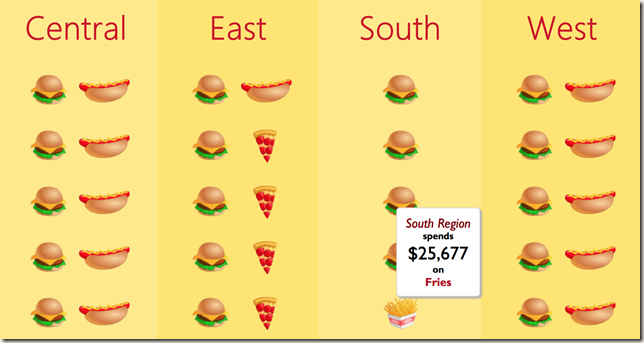
Same method can be used with multiple dimensions as well. The following example demonstrates this using Region and Product Type dimensions.
In this case, the custom SQL query looks slightly different but rest of the process is the same.

You can do a lot more with custom marks if you are adventurous and prefer prioritizing visually interesting charts at the expense of readability and accuracy. For example you can use a custom mark like a stencil as shown below.
In this visualization, marks are overlaid on top of a stacked bar chart. Custom mark (the beer glass) has a hollow center (transparent PNG) and is on the secondary axis where the bottom of the glass is fixed at 0 to achieve the effect. White, yellow color pattern is used in stacked bar chart to resemble beer and foam. This chart is visually interesting but especially considering lack of axis and the fact that it is unclear whether the quantity is associated with the height or area, it is not easy to interpret.
You can take it even further and use images themselves to mimic bar charts as shown in the following example.
I hope that’s enough for the infographics. How about something more exciting, such as directed graphs? You could create a graph in Tableau using a dual axis chart combining lines and circles. But how do you indicate direction?
The first tab in the Tableau public visualization linked via the image above shows how to achieve this using custom marks. This is done by creating 360 custom marks to cover every 1 degree rotation of arrow and first vertex. A calculated field determines the angle for each edge which is used to decide which rotated arrow to display. Note that since the graph can be dynamic, the domain of the field on marks card (angles) may also change. This may lead to changes in what mark is used for what angle. To avoid this, if you look at the dataset associated with this example you will notice that the complete domain (of all possible angles) is added to provide padding but then “pseudo-filtered out” using Pages shelf so these rows don’t have any effect on the visualization itself.
An even more interesting way to do this to use the polygon mark type and custom render the arrows. This example uses the binning technique we discussed earlier to generate rows to accommodate each arrow (each arrow is made up of 8 points).
XFirstStep and YFirstStep fields draw the arrow and scale it based on the distance between points it will connect. Then rotatedX and rotatedY fields take the arrow and rotate it based on the angle between the two points. Since the arrows are rendered as polygons, they could be modified on the fly. I took it one step further and even parameterized the arrow so you can design your custom arrow! Just use the “Design your arrow” tab : ) Below is an example of different arrows you can create…
Enjoy!


This is really awesome!
I was trying to mimic what you’ve created here but failed. I downloaded your workbook. By putting the same measure and dimension into the same places, it only gave me a blank graph. Does the order of setting those measures and dimensions matter? Or did I missed something?
I’m new to Tableau and specially table calculation, so please forgive me for this naive question. 🙂 Thanks!
I would start with dragging dimensions since table calculations have addressing/partitioning settings which are lists of dimensions.
Most likely the issue is that addressing/partitioning settings are not the same. Best option would be to open the original workbook in a separate Tableau instance as you go through the process so you can look at settings for a calculation and replicate them in your workbook.
You can access these settings through “Edit Table Calculation…” option in the pill context menu. Some of these are nested table calculations so you will see a drop down at the top of table calc settings dialog that will allow you to adjust settings for each underlying calculation as well.
The addressing/partitioning and sorting settings and the order of items in advanced table calc settings all matter.
Here are some tutorials to get started on table calcs
http://drawingwithnumbers.artisart.org/want-to-learn-table-calculations/
Awesome work, but I’ve a problem. I’ve been trying to replicate the “Annual Births” customized bar chart, but I couldn’t make it. I’ve even tried to add a new sheet to your workbook and use the exact same measures and dimensions, but it simply doesn’t work. It seems that I’m making some kind of mistake with the table calculations settings, but I can’t figure out what I’m missing
Hi Bora,
great post, useful for those who want to inject a bit of ‘wow’ even if not strictly adhering to the doctrines of Tufte & Few 😉
I think what’s throwing off Ran & Ottame (below) is that you don’t mention the need to turn off automatic aggregation… (untick Aggregation under ‘Analysis’)
You are probably right. Ottame, Ran did that help?
Yeah, that have definitely helped! Thank you James for the useful tip and thank you again Bora for this beautiful viz. Needless to say, all my collegues at work were really impressed with the results 😀
Love this
I really liked your way of approaching the creation of bins. especially where you split the marks. Genius! 🙂
This is not likely to work in an instance where we have negative values isn’t it? Let’s say we are plotting Profits, and 3 regions are profitable and one is not? How would you use the stacked icons approach to show both positive and negative values? Any thoughts would be really appreciated.
That wouldn’t be an issue for the “filled bar chart” since there is a proper axis.
For stacked icons, you can rely on different images (they could be completely new images or same image rotated) or different colored versions of the same image for negative and positive values. Another option would be to split negative and positive into separate panes e.g. imagine instead of regions : East, West… splitting into the opposite categories.
You can combine these as well e.g. stack the panes vertically putting the positive values inside the top pane and negatives in the bottom pane while also using different images or colors.
Pingback: Radial treemaps & bar charts in Tableau « Bora Beran
How do you actually get Tableau to display those custom images . Nowhere does this article actually say how to do that… or did I miss something? Sorry – I’m a Tableau newbie! Thanks!
In your Tableau Repository folder under My Documents you will see a folder named Shapes. You can drop the folder containing the icons you want to use in there and they will show up in the list of shapes.
Thanks Bora, I’ll try that!
please upload the dashboard , I can download it .
It is on Tableau Public already. You can download it from there.
Thanks for your post which helps me to create the custom water shapes in my ‘Product Water Footprint’ viz at http://vizscapes.blogspot.com/2015/05/the-water-footprint-networkbased-in.html?_sm_au_=iVVjLPj0M46nDMFN
Very interested to learn how you get the ‘Usual suspects’ to align on the zero line, as opposed to have the zero line as their centre? Is this to do with how you created the icons?
Yes. The icons are actually double the height of the visible image. It is centered at zero but bottom half is a transparent image.
Of course! Nice & simple. Thanks 🙂
Hello Boram,
First off, thank you for your great work. Your one of the best out there.
Question: Like two Ottame and Ran, I’ve tried recreating your annual births graphic to no avail. Specifically, I can seem to get my custom graphic shapes to come as close as yours. There are huge gaps and white space. And as much as I have reverse engineered your shared piece, I can’t get mines to be the same.
I’ve posted the details of what I am trying to do in full on the tableau forums, link is below:
http://community.tableau.com/message/402994#402994
Can you visit, take a look, and respond either there or here on your page?
Thank you so much!
Is it possible to do the same in filled map . I mean having different image as background for each section (say state in a country ) ???
Not sure I understand the question. You mean filling a polygon with shapes?
I have tried to build the same chart (the first one) and I don’t know why it doesn’t work. Even copying everything step by step and having a look at your original woorkbook. Weird.
Hi Boram,
your post was really great and useful to get an overview and also to see what could be done with a not so standard Tableau functions and it looks really promising.
I have tried your last example with arrows to indicate directions.
Sadly I could not make it work because of some limitations/lack of knowledge, how to transform this formula to work under conditions, where dimensions are not aggregate ones. In my case I am using a very similar plot, but I have latitude / longitude instead of X and Y dimensions. In your case these were aggregated by SUM(), but I cannot do so in my case, because these coordinates produce a map overlay.
Could you take a look and say if there is a way to amend or change the formula to make it work with non-aggregate dimensions like mine?
Adopted formula for the aforementioned calculated field looks like this:
IF WINDOW_MAX(MAX([segment_id]))>999 THEN WINDOW_MAX(MAX([domain_filler]))
ELSEIF MAX([path_id])=WINDOW_MAX(MAX([path_id])) THEN
ROUND(180*ATAN2(LOOKUP(SUM([latitude]), LAST()-1) – LOOKUP(SUM([latitude]), LAST()),
LOOKUP(SUM([longitude]), LAST()-1) – LOOKUP(SUM([longitude]), LAST()))/PI())
ELSE 360
END
I would be grateful for any hint or link to possible solution.
As I’ve said before, this DOES produce an angle number, but only when not plotted on top of the map chart type.
Seems like I’ve found a solution myself, which is to change the aggregates from SUM into AVG in this case.
It should be changed both in the formula above and also on the axes (columns/rows pills) in order to make it work.
And one more thing that was blocking correct angle measurements was some additional fields added to the Detail or Label settings. These need to be addressed in aforementioned “Compute Using…” option.
Hi Bora,
Great blog and thanks for putting this tutorial together. For some reason when trying to recreate the multiple shapes I can never get it to work. I always end up with one shape only at the point of my defined bin. I’ve put something in tableau public to illustrate this. Can you see where am I going wrong?
https://public.tableau.com/profile/david.pires#!/vizhome/MultipleShapes/Sheet1
Thanks
David
Hi David,
You only have 1 row in each category that’s why you’re only getting one mark. The second part of the post addresses this case by showing how one can rely on densification to draw more marks than there are rows in the data. It is the section that starts with the sentence “In this case, my dataset contained enough rows to accommodate all the marks I needed for my visualization.But what if it didn’t? The next example answers this question.”
Bora
Thanks Bora for the quick reply. I’ll go back and read it again. By the way your presentation on Lod in Vegas was great.
Thanks. I am glad you enjoyed it.
Hi Bora,
I’ve looked into the custom sql option but as this is from excel it might not work. I have to do some reading on densification. But I did deaggregate the data and tried to get it work but was giving me the same result. I then thought I’d do it with the EU sample superstore that comes with desktop and I’m getting the same results. I’ve look at the “compute using” and put mine and yours workbook side by side and I can’t see where I’m going wrong. If you have time would you mind having a look at this? https://public.tableau.com/profile/david.pires#!/vizhome/MultipleShapes/Sheet1
Many thanks
David
Pingback: #MakeoverMonday: Football’s Wage Gap – ivisualize.co.uk
Hi Bora
I tried you beer graph with bottle fixed, but with different measures in both axis, i am unable to fix the bottle to the bottom, can you please help.
Tableau centers the icon vertically. So you need to have the image double the height where the bottom half is empty and transparent.
Hi Bora,
Is your approach above for annual births possible if input data is already aggregated. Essentially, I have one input number, let’s say 100 students, that I would like to represent with 10 custom shapes…..1 shape representing 10 students each.
Thanks!
Suzanne
Hi Suzanne, did you manage to create the chart when the data is already aggregated? the shape images in this case are not filling the axis.
Does it not work, if you turn off aggregations for the view (no change for calculated fields)?
Yeah, my data source is just three records.
category sales
A 1000
B 1500
c 2000
there is no order level data, so turning off aggregation is not making any difference. Is there a way to fill up the axis with the shape ?
Hi there – I’m having trouble with the partially filled people icons. I’ve copied your ‘Shapes’ calculated field, but when I drag it on, it messes up the view. Is there a specific order in which I need to do things?
Thanks in advance
Pingback: Learning filled shape charts in Tableau – Frederic's Tableau data visualisation sandpit
Reblogged this on tableau dot live.