In this year’s last post, I want to put a little spin on the bar charts and tree maps : )
While in a lot of cases pie charts aren’t great, they nicely convey the part-whole relationship, work reasonably well as long as the number of slices are small and used very commonly including by Tableau users. I recently came across two blog posts that took it a step further and built donut charts (1, 2) out of pie charts. Both of these posts used overlay methods to hide the center of the pie chart which makes them easy to replicate (and that is what’s great about them) however they either have misalignment issues or when you interact with the donut e.g. by clicking on it or hovering the z-order changes and your pie chart floats above the overlay so it is no longer a donut chart.
I wanted to do something that doesn’t have any of these issues and while doing that also enable stacking in various ways so it can also be used to generate radial bar charts and radial tree maps (also known as sunburst charts).
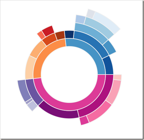
I also wanted to add some customizability such as the thickness of the bands and spacing between them. Below is resulting radial tree map. You can click HERE or on the image to play with the interactive version published on Tableau Public and download the Tableau workbook to take a closer look at how it works and apply to your own data if you like.
I created some imaginary sales data broken into categories: Furniture, Electronics and Food and then further into sub-categories e.g. Security Systems, Home Theater, Baked Goods etc. In the image above, the 3 major categories are represented by the inner-most ring. Each outer ring represents an immediate subcategory of the adjacent inner ring hence creating a hierarchical tree-view when read from the center outward.
The chart is created using the polygon mark type. Each point that make up the polygon are computed on the fly using 9 table calculations that are nested inside each other.
Input data looks like the following :
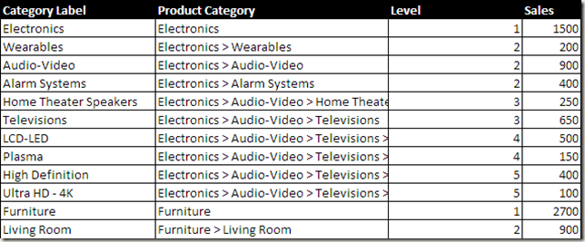
This table could be further simplified by counting the occurrences of > in Product Category column using a calculated field instead of having a Level field but I chose not to in case I wire this up to a live SQL query at some point and Category name contained a > that’s not properly escaped.
I used the same trick I showed in my Coxcomb chart and pictogram posts to generate extra rows that leverages custom SQL, binning and densification to hold the calculated coordinates since each arc is approximated using ~200 points to get a smooth curve while there is only 1 row in the input data for each category. Please take a look at the previous posts if you’re curious how this works. The rest it trigonometry.
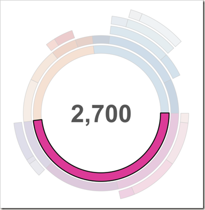
If you put this inside a dashboard and add an action you can also display the sum of values for selected slices at the center of this chart. As I said, since the chart is parameterized, you can change the spacing etc. between layers which is what I did below to get a slightly different look.
I am not going to get into the details of how exactly each calculation works. Best way to recreate these charts with your data is to convert your data into the format used by the workbook (as shown in the Excel spreadsheet above) and replace the data source. This way, you won’t have to worry about calculation settings and it will just work.
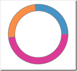
Now to get a donut chart, all you need is data that doesn’t have multiple levels and same calculations will give you this result.
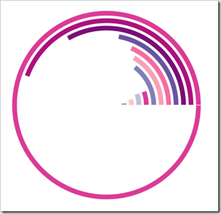
With slight modifications to 3 of the 9 calculations, it is also possible to generate radial bar charts using the same template. In the example below I also changed the sort order such that I get bars in ascending order from the center outward. The outer-most ring represents all of Furniture sales while inner rings represent sub-categories of furniture.
And there you have it. One template to build 3 common radial charts in Tableau. I hope you find this useful.
Happy new year!
I find this really cool! I just started using tableau and will be doing an internship trying to create reports for a company! Do you think you can make a youtube video of the steps for easier understanding?
I would be a lot easier to convert your data into the format used in the workbook and then do a replace data source.
I’m trying to replicate the radial bar chart as well. I can’t convert my data into your required format because this graph is part of a larger dashboard and the data layout is already set (and works for everything else in the dashbaoard). I don’t know where I went wrong but I can’t get anything to display in the graph area, even though I’m pretty sure everything is in the right place with the right settings.
How crucial is the level values ? If I only want to display values at the same level can that be ignored/removed ?
It is hard to tell without looking at your workbook. But level values are used to calculate what’s within the same level so the size of slices can be calculated correctly. They are also used to calculate the radius increments for stacking so circles don’t overlap with each other.
Hey Bora, This is really cool. But it will be good if you share more details may be each steps of this full chart creation. That will be more helpful.
Hey bora, this chart is awesome. I got an issue with the shape. I couldn’t get the exact circle and it is getting overlapped. Is there any option to view my dashboard to solve the issue. If so please help me.
Can you post it on Tableau forums by any chance if data is not private or somehow anonymized? If you @mention me on the forum I will get an e-mail alert so I can track down the thread easily.
I replied on the forums. The issue is with the data. The values don’t add up. Once you update the data, it will work. Boston, Miami and New York are the only 3 slices in the East region but they constitute less than 50% of it. If there is unaccounted data that really doesn’t belong on any of the cities, please add it as a separate category and things will align.
Pingback: BIG Favorites from the IronViz Wiki Round
Hi Bora, Please share stepwise details for the full chart creation. It will be of great help.
Hi Bora, this chart is really awesome.
I tried to re-create the ‘radial chart – fixed size’ view in a new sheet with your data itself.
But I am missing something here and did not get the view.
Could you please provide a step by step instruction or a youtube video on how to create this view?
Hi Suresh. I took a shot at your question and the main issue is that the view is created with certain dimensions and measures set with certain table calculations so there are some details that are not shown in the chart (at least at on first glance). I have produced a video showing how to create it https://youtu.be/Gaj6x9UhtRY. Thanks Bora for creating this awesome visualization.
Great post! Wondering if I can add an additional column to the source table, such as year and create a parameter for it, so that users can interact with the visualization by choosing a specific year from the filter and see the donut chart for this particular year.
You can definitely do that. If you add a parameter to the custom SQL and then expose it through a widget in Tableau that won’t require any modifications to the chart. You can also do the same by adding a quick filter and making it single select. If you add a multi-select filter,then you would need to make sure you have the right aggregations so you make sure you get the right results when several years are selected e.g. minimum values in those years vs sum of all or average..
Love the radial chart, but I’m having trouble re-creating it. I’ve downloaded your workbook, and tried to create a new worksheet and re-create yours but despite meticulously going through and copying all the settings I can’t get the radial chart to appear at all (so as far as I can tell, data, settings, etc) are identical). It seems that the chart type is the difference but besides using the selections in the show me tab – which don’t work – I’m stumped. Is there some kind of special instruction with regards to the chart type?
Ok. I think I’ve figured it out. I’m using tableau on a mac which at this point doesn’t support the custom SQL. So while I can view and play around with the sheet you created, I can’t create my own. If I’m right, it all breaks down on the mac version because you’re using custom SQL to bin the Path number. Yours has path (bin) 1-203, mine just has 1 and 203 and nothing in between.
Could you please post the custom SQL you are using? (I also can’t access that statement AFAIK) Maybe I can figure out a different way.
Also, why are you only using 203 bins and not 365?
Cheers,
Tim
203 is an arbitrary number. It gives a good smooth curve, hence I picked it. Here is the SQL but it will only give you 1-203. You get the rest through the (bin). If you select the option “Show Missing Values” in the bin, it will have 203 bins even though the data only has two points : 1 and 203.
SELECT [Sheet1$].[Level] AS [Level], [Sheet1$].[Parent Category Label] AS [Parent Category Label], [Sheet1$].[Product Category] AS [Product Category], [Sheet1$].[Sales] AS [Sales], 1 AS Path FROM [Sheet1$] UNION ALL SELECT [Sheet1$].[Level] AS [Level], [Sheet1$].[Parent Category Label] AS [Parent Category Label], [Sheet1$].[Product Category] AS [Product Category], [Sheet1$].[Sales] AS [Sales], 203 AS Path FROM [Sheet1$]
is the input file needed really just these 4 columns, or do you need to include ‘Path’ in there as well and just make those vales 1 and 203 (for the duplicate)? Also, shouldn’t it be ‘Parent Category Label’?
I am also still getting ‘blanks’ when even trying to recreate the ‘imaginary sales data’ radial chart within your workbook as well much like the other user comments
Is the total sales number in the center of your radial chart correct? I think it should be $5,600 instead of $15,000+. It appears like you are counting sales multiple times
Good catch. I will publish the updated version later tonight.
Hi Bora Beran,
I want to create a sun burst chart with 4 levels – Make of the car, Model of the car, Mobile Device Manufacturer and Model of the Mobile Device. We have like 10,000 rows of Data. It’s tough to create a data model in Excel like what you did. So, I cannot replace the data source like you suggested. Is there any other way to create a Sun Burst chart for my requirements?
Thank You,
Arun Prakash
Do you need to aggregate 10,000 rows of data first or do you need 10,000 slices in your sunburst chart? Also what is the data source. You should be able to generate a similar table structure by writing a SQL query that will return such results. If you can share a workbook, I can take a look. But probably Tableau forums is a better place for that so you can attach it to the forum thread and others can also benefit from the results.
Thank you for your response. I need to aggregate 10,000 rows of data. The data source is from Amazon Red Shift. As you mentioned, I have attached the files in the tableau forum: http://community.tableau.com/message/420782#420782
It would be greatly helpful if you can check over there and help me out in this.
Best,
Arun Prakash
Hi Bora,
It would be greatly helpful if you can check out my previous post and help me ot in this.
Thanks,
Arun
Hii Bora,
Can you please explain the formula’s which you have used for drawing the charts?
It would be great, if you can explain me
Thanks,
Pooja
Hii Bora,
Can you please explain the formulas in short which you are using in calculated field.
It would be great, if you can help.
I want to try more charts , hence needed basic understanding of the same.
Thanks,
Pooja
Bora,
Thank you for your inspirational work. This is truly impressive work. One question: How are the colors sequenced so that outer rings are hues based on the prior level? They seem to be responsive as the data set changes, but I haven’t discovered the mechanism. I assume it’s a more elegant solution than manual color selection.
Thanks!
Hi Bora, this is fantastic, very impressive ;
I was wondering if you would answer two questions:
1. is there a way to show on the bars what level it is for instance : electronics > alarm systems etc, so that it can be exported out with the level
2. how would I go about removing the $ sign, if I am not plotting sales
thanks much
Taking a stab at #2. there: I believe you can click on the tooltip option undermarks and it should show you the current settings for text displayed, amongst those you should see:
$
I think you can delete the $ sign from there and click “Ok”
Edit:
You should see:
$ < A G G ( M a x S al e s ) (greater than sign)
I think you can delete the $ sign from there and click “Ok”
Dear Bora, i tried to replace your data – like it is displayed in tableau – copy it to Excel and import it in tableau again. But if i take exactly these data i see in tableau, it want work when i’m trying to replace the data source. A lot of parameters are missing this way.
When i follow the way you described to arrange the date in an excel sheet e.g. it doesn’t work, too… Any help on this? All the best
Hi Hirshferkel – I am not sure if you have seen my video response to what I think was a similar question https://youtu.be/Gaj6x9UhtRY. Let me know if that helps.
Hi Kieng, thanks a lot. I didn’t find it while i was trying to import the table from Excel… and these days i didn’t find it on youtube, too. But that helps a lot… unfortunately it’s quite laborious! I did not expect it to be so complicated. I expected the calculations would be set up somehow automatically… or be more intuitive and easy to set up. I think the whole tableau idea does not inspire me quite much… but the sunburn chart is amazing!
Pingback: Live Polar Clock in Tableau by Chris DeMartini | DataBlick
Um…. You’re like…. AMAZING! Thank you so much for sharing your brilliantly incredible Viz’! I’ve been searching for a mathematical approach to a donut chart and your Coxcomb chart is outstanding! Thank you very much!
Great job Bora…I always found outstanding dashboards in your blog.Please share your email ID so that I will share my sample twbx in this context.Actually the calculations you used is a bit complex for the curve/chart.Mainly I need to ask how should I prepare my data to get the desired D3 chart in tableau.
There is a video response in the comments section that does a step-by-step tutorial on how to build them. Did you check that out?
hello, i made a chart like you, but i don’t understand why there is a overlap in the chart, could you
give your help about that? thanks very much!
Is it possible to replicate this using Superstore data?
Pingback: Bloom in Time: A Venture into Constructing Radial Treemaps in Tableau - The Data School
Hi Bora! This chart is awesome, thanks for sharing everything! In my version, I added in a highlighting action so that when hovering over each block, it would highlight that block. I want to try and get the whole hierarchy to highlight, instead of just the block that I am hovering over, but I haven’t been able to figure this out yet. Any ideas?
Pingback: #makeovermonday: Women’s Rights – ivisualize.co.uk
Hi Bora superb chart that was……I want to ask one thing, if we want to add the label to each slice, can we do that in sun burst chart.
It is possible but if you have lots of slices it may not look great. Polygons can’t have labels but lines could. So what you need to do is to duplicate one of the pills e.g. ctrl+drag Y next to itself. Then select dual axis from its context menu and then click the axis and select Synchronize.
This would give you a marks card. Convert mark type from polygon to line for one of the cards. You will see that line has the Label shelf enabled. Then you can add a calculated field like this one
IF INDEX()=INT(SIZE()/4) then WINDOW_MAX(ATTR([Parent Category Label])) END
which would put the label roughly in the middle of the slice. You need to set Compute Using to Path(bin) for this calculated field.
Hi Bora,
Great job…., I am trying to replicate radial chart , but that circle not formed perfectly after enter 3rd level of data. All level of circle break after plotting 3rd level on the chart.
can u please suggest me what is the problem and how i can calculate the calculation for required problem.
My datasoure is Google Analytics.
How can I create “Path” field?
I think I can’t create a “New Custom SQL” query.
Do you have any suggestion?
Thanks in advance
Simona
Maybe you can piggy back on another existing field? E.g. create a Path calculated field like
if [X]={fixed Category : MIN([X])} then 1 else if [X]={fixed Category : MAX([X])} then 203 end
Bora – awesome stuff! This type of chart was exactly what I was looking to do – thank you for sharing. Question: currently the Sales Number in the middle of the chart shows an incorrect amount if nothing is selected (the aggregated total of all slices). How can I get it to show nothing when there is no selection?
The Path column is not in the picture of the excel document with the raw data. What is that supposed to be? Just 1s in the Path column in excel?
It is added via custom SQL
SELECT [Sheet1$].[Level] AS [Level], [Sheet1$].[Parent Category Label] AS [Parent Category Label], [Sheet1$].[Product Category] AS [Product Category], [Sheet1$].[Sales] AS [Sales], 1 AS Path FROM [Sheet1$]
UNION ALL SELECT [Sheet1$].[Level] AS [Level], [Sheet1$].[Parent Category Label] AS [Parent Category Label], [Sheet1$].[Product Category] AS [Product Category], [Sheet1$].[Sales] AS [Sales], 203 AS Path FROM [Sheet1$]
Hi Bora, This is really great..But I am stuck with the some of the mathematical concepts you have used. I am trying to understand the concepts behind this and the logic inside Sin() and cos() you have used.Can you help me with some resources to understand these logic. I can understand the coordinate geometry. please give some insights to the concepts used to get this radial chart.
Thanks in advance.
I have posted a query in forum also.
https://community.tableau.com/message/501513#501513
Regards,
philip
Hi Bora,
I am trying to find out the concepts you have used behind the graph. Could you please help me with some resources to understand the maths logic you have used here. I understand the coordinate geometry.
I have posted a query in forum also.
https://community.tableau.com/message/501513#501513
thanks in advance.
regards,
philip
This is a great post! I’m trying to use this template for a project. I’ve formatted my data to mimic your data source, but am unable to replace the data source (the option isn’t available. Do you know why that may be?
Do you have any other data sources in the workbook to replace with?
I do, it’s in the same format as the data you presented, and is in the same worksheet. For some reason the “replace data source” option is unavailable (I cannot click on it)
Hey Bora,
I figured out how to replace the data source, but it’s saying that “Bin ‘[Path (bin)]’ depends on non-existent field ‘[Path]’, ignoring bin.” I formatted my data so it looks like the table above, do I have to make sure there are a specific number of categories?
Hi Bora
what is the use of “path” field here in this chart?
I have not any path field in my data and my data is connected to salesforce. Also have 3 measur fields that i need to show in form of radial bars.
if we don’t have “level” and “path” fields in our data then would it be necessary to take these fields as extra field?
You can add them via custom SQL. That’s the path the curves used in drawing the chart follows. Calculation follows the coordinates but to draw the proper curve, it needs to know in what order to connect the dots.
Pingback: Radial charts – learningtableaublog
Pingback: Inspiration for the History of the Olympics Viz (Reviz) | The Duchess of Data
Pingback: Tableau Wifi Polygon Tutorial
Pingback: Quick Tip : Overlaying curves on Tableau scatter plots with R « Bora Beran
Pingback: Radial Stacked Bar Charts in Tableau | Ryan K Rowland
Pingback: Radial Stacked Bar Charts in Tableau | Ryan K Rowland
HI Bora,
Is it possible to bind also the color value from the data source instead of having default palette?
Boran, your chart is incredible, but I’m still struggling with the Path and Path (bin) dimensiones. I have tried with your expresion avobe ( if [X]={fixed Category : MIN([X])} then 1 else if [X]={fixed Category : MAX([X])} then 203 end) but I dont reach how to prepare the excel spreadsheet data to make it work…can you help with this? Thanks a ton!!
Best,
BQ.
If you create an Excel spreadsheet that matches the format shown in the screenshot you can create the Path field using Custom SQL
SELECT [Sheet1$].[Level] AS [Level], [Sheet1$].[Parent Category Label] AS [Parent Category Label], [Sheet1$].[Product Category] AS [Product Category], [Sheet1$].[Sales] AS [Sales], 1 AS Path FROM [Sheet1$]
UNION ALL SELECT [Sheet1$].[Level] AS [Level], [Sheet1$].[Parent Category Label] AS [Parent Category Label], [Sheet1$].[Product Category] AS [Product Category], [Sheet1$].[Sales] AS [Sales], 203 AS Path FROM [Sheet1$]
Hey Bora, I managed to build your chart.Thanks for creating this tutorial!! Quick Question. How can I use the action to highlight the whole path. E,g If the user clicks on Desks I want Office and Furniture to be highlighted as well so that users see the whole path. I created this for the page flow use case with 6 -10 steps. And certain slice is so thin that it is hard to figure where it is coming from. Highlighting all the way back to the first sequence will definitely help.
Thanks!
Paul
Thanks for this Boran. Very helpful.
I have been able to use your example with my data after climbing the learning curve.
I would like to use a different (additional) dimension to color the arc segments however I cannot figure out how to get this to work.
Specifically, on the [Radial Tree – Fixed Size] worksheet, I want to replace the [Level] and [Parent Category Label] with an additional column containing values from an enumeration; I would like to set the Color for each arc based on the enumeration value. The enumeration would be analogous to the quality of the Sales in your example; please note that I want to retain setting the size of the arc [Size of Slice] from [Sales] as you have done in your example.
Pingback: Sunburst Chart in Tableau - TableauLearners TableauLearners
Pingback: Sunburst - Toan Hoang
Pingback: Sunbursts in Tableau: One Pivot, One Join, & Three Simple Calculations – THE DATAISM
Pingback: Tableau Tips (Radial Bar Chart) – Vizdom
Pingback: Who else is drinking a morning coffee? – Double Shot of Data